ONE of the joys of journalism is gaining insights into people, professions and situations that would otherwise have passed you by – and a recent interview with a University of Reading graduate shone a light on an under-appreciated yet ubiquitous area of expertise.
As a typographer, Nadine Chanine designs fonts which shape the way millions upon millions of people view the world. From the signs at train stations to the type on screens and in print, Nadine’s creativity provides form and adds emphasis to the words of others.
This facet of her skill-set was especially apparent when she shared the story of Gebran2005. Designed at the request of the daughter of a Lebanese journalist assassinated in a car bomb attack, the font was the centrepiece of a redesign of An-Nahar newspaper and makes a defiant stand against political intimidation.
The feature, which appeared in the latest issue of Reading’s Connected magazine, can be read in full below. If you’d like to talk to us about feature writing, please call 01252 714870 or email steve@tylerbale.co.uk
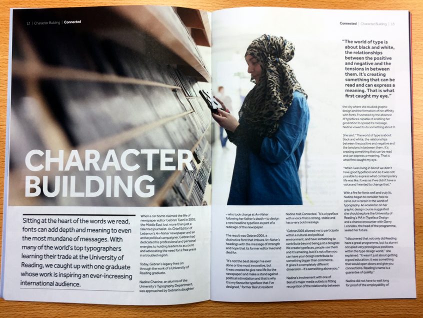
WHEN a car bomb claimed the life of newspaper editor Gebran Tueni in 2005, the Middle East lost more than just a talented journalist.
As chief editor of Lebanon’s An-Nahar newspaper and an active political campaigner, Gebran had dedicated his professional and personal energies to holding leaders to account and advocating the need for a free press in a troubled region.
But although his assassination in the Beirut attack put an end to his active role, Gebran’s legacy lives on to this very day through the work of a University of Reading graduate.
Nadine Chanine, an alumna of the university’s Typography department, was approached by Gebran’s daughter – who took charge at An-Nahar following her father’s death – to design a new headline typeface as part of a redesign of the newspaper.
The result was Gebran2005, a distinctive font that imbues An-Nahar’s headings with the message of strength and hope that its former editor lived and died for.
“It’s not the best design I’ve ever done or the most innovative, but it was created to give new life [to the newspaper] and make a stand against political intimidation,” former Beirut resident Nadine told Connected. “It is a typeface with a voice that is strong, stable and has a very bold message.
“Gebran2005 allowed me to participate within a cultural and political environment and have something to contribute beyond being just a designer. We create typefaces, people use them and it’s amazing, but it’s not often you can have your design contribute to something bigger than commerce.
“It gives it a completely different dimension – it’s something above you.”
Nadine’s involvement with one of Beirut’s major media outlets is fitting recognition of the relationship between the city where she studied Graphic Design and the formation of her affinity with fonts. Frustrated by the absence of typefaces capable of enabling her generation to spread its message, Nadine vowed to do something about it.
She said: “The world of type is about black and white, the relationships between the positive and negative and the tensions in between them. It’s creating something that can be read and can express a meaning. That is what first caught my eye.
“When I was living in Beirut we didn’t have good typefaces and so it was not possible to express what contemporary life was like. It was as if we didn’t have a voice and I wanted to change that.”
With a fire for fonts well and truly lit, Nadine began to consider how to carve out a career in the world of typography. An academic on her Graphic Design course suggested she should explore the University of Reading’s MA in Typeface Design and a chance encounter with Gerry Leonidas, the head of the programme, sealed her future.
“I discovered that not only did Reading have a great programme, but its alumni occupied very prestigious positions within the type design world,” she explained. “It wasn’t just about getting a good education, it was something that would open doors and give you connections. Reading’s name is a guarantee of quality.”
Nadine did not have to wait long for proof of the employability of Reading graduates. Invited to talk at a conference after graduating, she was hired immediately by the Lebanese American University. Her subsequent stellar career included a short spell at the American University in Dubai before Linotype – now Monotype – snapped her up as its Germany-based Arabic and Legibility Specialist.
She now serves as Monotype’s UK Type Director and Legibility Expert, a role in which she heads up a team of four people – all of them fellow graduates of the University of Reading.
Nadine joked: “Within the type world, people call us the Reading Mafia! We are everywhere, in every big foundry and every big company.”
As the building blocks of the words we read, whether through the paragraphs on this page, the signs on our roads or the logos on our favourite brands, fonts play a huge, if subtle, role in all of our lives.
But while the nuances of the typefaces we see every day may pass many of us by, how does it feel for designers to see their own creations used to convey messages to the masses?
“It’s amazing,” enthused Nadine. “The first time I ever saw one of my typefaces in real life I almost caused an accident because I was screaming in the back of a taxi and the driver got scared!
“It’s the equivalent of a tequila shot – every time you see your typeface in use, you get that rush of euphoria. It’s your baby out there in the real world and it’s hard to describe the sense of fulfilment that brings.
“We create ingredients for communication and they don’t come to life until someone has used them. To have someone use them to say something – hopefully something of value – is amazing.”
Although her work adorns newspaper front pages, branding and signage the world over, it is perhaps fitting for Reading graduate Nadine that one of the fonts of which she is proudest will soon be a familiar sight to millions of pairs of eyes in England.
Her team is responsible for the creation of Johnston100, a revitalised version of the century-old Johnston typeface used by Transport for London. The typeface is currently being rolled out across TfL’s stations, signage and printed material and will eventually find a home on Crossrail’s Elizabeth Line – including the station at Reading.
For my team, this is definitely the highlight,” said Nadine. “It means we become part of history – and not just any history, but that of the most iconic part of London. It is famous worldwide and we are now part of that story.”
As a quick flick through the font menu of any word processor or a cursory internet search will reveal, the world is not short of typefaces. Classics like Times New Roman and Helvetica, iconic selections such as Frutiger and even the much-maligned Comic Sans allow users to add widely-understood additional layers of meaning to their words.
With such a wealth of fonts freely available, Nadine admits that injecting innovation into a market already containing thousands of typefaces can be “very, very difficult”.
But, much like the inter-disciplinary nature of the University of Reading’s research, Nadine is an advocate of drawing inspiration from different fields to ensure striking results for TfL and Monotype’s other clients.
She said: “I try to have the team look not at what exists and the genres we have, but rather what the purpose of the typeface is, what it’s meant to do and the spirit it’s meant to convey.
“From there we take inspiration not from the world of typography, but from life itself. That pushes the boundaries, makes your design space bigger and automatically brings in new DNA.
“Those ideas might not have anything to do with the design you’re looking at, but creativity comes when different fields collide with each other, not when you isolate yourself in one environment.
“With typefaces, we need to look to the world and to life and to other areas of creativity. From that we can make our design space bigger. It can be a car, a building, a thought or an idea that is not physical in dimension, but which gives you other ways of designing.”
The University of Reading’s positive impact on the world of typography is perfectly apparent at Monotype, where Nadine works alongside fellow alumni including font engineer Ben Jones and designers Marlou Verlomme – who worked on Johnston100 – and Toshi Omagari, who created Radikal, the Premier League’s new typeface.
Current students are often welcomed on internships, while new graduates find themselves swiftly snapped up. Nadine is now a regular returnee to Reading where she gives talks and advice and she is brimming with enthusiasm when asked about the potential of the next generation of typographers.
“I have been back [to the University] three times in the past year and I have to say it is scary how good the students are,” she said. “The scope of the work they do is so much more advanced than what we did.
“The technology is evolving, the speed of design is improving and, because you always need to distinguish yourself, we are getting more and more ambitious students.”
With her work seen and admired by millions and her career going from strength-to-strength, it speaks volumes for the impact of her studies that Nadine is still full of praise for the University of Reading more than a decade after graduating.
She concluded: “I loved my time there. There was of course the academic life, but there was also a very nice social life.
“It was the first time I lived away from home and away from Lebanon and there were eight of us on the same floor in halls who would cook and eat together or go for walks.
“We became like a family in those informal times and that day-to-day life made it special. The environment of the University helped foster really good relationships.”